New York City subway signage is in Helvetica Medium and Helvetica Bold. It has been the standard since the late 1960s, when Unimark International overhauled the subway’s signage system.
At one time the New York City subway system used a mix of typefaces and hand-lettered signs. Then in the late 60s Helvetica Medium and Helvetica Bold started to be used because the typeface is clean, modern, and legible at a distance.
More recently the Mass Transit Authority that runs the subway system has started to use Helvetica Neue, a later variation of the original typeface, using it mostly for digital and print materials.
But it has started to be used in signage as well. And so it’s natural to ask why the change?
The two fonts are closely related, but Helvetica Neue has a consistent baseline, x-height, and stroke weight across the entire type family, which the original font did not. So looking at it Helvetica it has more irregular spacing and sometimes feels tighter and sometimes more spread out between the letters depending on the letter arrangements.
Kerning
Kerning is part and parcel of the design of Helvetica Neue but not the original Helvetica. Kerning focuses on the perception of spacing rather than precise measurements. In other words, the arbiter of correct kerning is human perception. A maths-based approach is evenly spaced but doesn’t always look it for the simple reason that not all letters are the same width. With kerning built into the design some letter combinations will be spaced further apart than others in order to make the whole appear to be evenly spaced even when it is not.
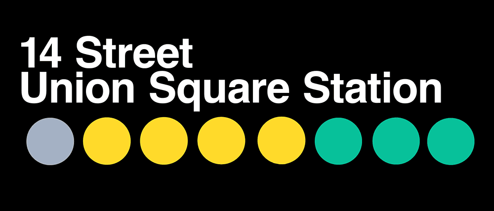
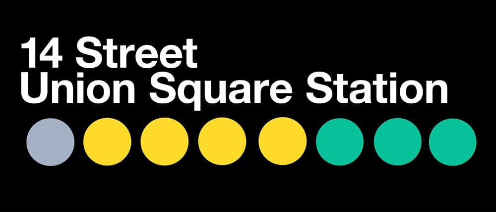
Here is a mock-up of a NYC sign with the first in Helvetica and the second in Helvetica Neue. Note the difference in the letter e and that way it affects the appearance of the word ‘Street’ that looks more relaxed in Helvetica Neue